If you’re in the print business, you know that it’s essential to keep up with new trends and technologies, and provide your customers the best service and advice. Design and graphics are probably at the top of the services you offer, and it’s important to understand the meaning of colors and match them to each print job.
Studies along the years show that color increases brand recognition by more than 80 percent. As a print service provider, your business must know how to choose or help the customer choose the right color scheme that will tell the story of the brand.
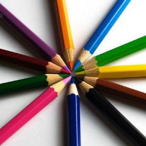
Know the psychology of color
Different colors may evoke certain emotions in people, so it is quite possible to use colors to your advantage and needs. Check out this list of colors and how they can serve a marketing purpose:
Red is associated with elements like fire and blood, so it conveys a message of intensity, passion, energy and vigor, and is often used to stimulate people to make quick decisions.
 Orange stimulates the appetite, so it is extremely useful for promoting food products or packages. Plus, it’s a great color to communicate messages about creativity, determination and success.
Yellow is considered as a very positive color, associated with joy, optimism and happiness. Marketers use yellow to promote children’s products or items that are used in leisure activities, and also to highlight key areas of a design and encourage impulsiveness.
Green mostly associates with wellness, nature and safety. Green can be used for medical and drug products, and also for environmentally-friendly products. Dark green is often used in financial sector advertising.
Blue signifies trust, reliability, stability and truth. It is often used to grant products a feeling of trust – such as banks, law enforcement and even Facebook and Twitter. Blue suppresses appetite, so it should be avoided when promoting food products.
Purple is associated with power, ambition, royalty and magic, and a lot of advertisers use purple to promote feminine products. Also, young children often say that purple is their favorite color, so it’s recommended to use purple when advertising products for children.
Black symbolizes power, masculinity, mystery, elegance and formality. It is mostly used to advertise masculine products, games, high fashion and even finance.
White associates with purity, cleanliness and simplicity. It can be ideal for promoting medical or pharmaceutical products, and also for electronics or technology since it denotes simplicity.
Brown is a warm color, associated with earth and homeliness. Rich brown shades can evoke a positive emotional response and are best for industries such as foods, furnishing or real estate.